/*
* jQuery Nivo Slider v3.2
* http://nivo.dev7studios.com
*
* Copyright 2012, Dev7studios
* Free to use and abuse under the MIT license.
* http://www.opensource.org/licenses/mit-license.php
*/
/* modified to use with RSSFeed by GPackage */
/* The Nivo Slider styles */
.nivoSlider {
position:relative;
width:100%;
height:auto;
overflow: hidden;
}
.nivoSlider img {
position:absolute;
top:0px;
left:0px;
max-width: none;
}
.nivo-main-image {
display: block !important;
position: relative !important;
width:100% !important;
}
/* If an image is wrapped in a link */
.nivoSlider a.nivo-imageLink {
position:absolute;
top:0px;
left:0px;
width:100%;
height:100%;
border:0;
padding:0;
margin:0;
z-index:6;
display:none;
background:white;
filter:alpha(opacity=0);
opacity:0;
}
/* The slices and boxes in the Slider */
.nivo-slice {
display:block;
position:absolute;
z-index:5;
height:100%;
top:0;
}
.nivo-box {
display:block;
position:absolute;
z-index:5;
overflow:hidden;
}
.nivo-box img { display:block; }
/* Caption styles */
.nivo-caption {
position:absolute;
left:0px;
top:10px;
width:auto;
max-width:60%;
height:auto;
max-height:80%;
z-index:8;
padding: 5px 10px;
opacity: 0.8;
overflow: hidden;
display: none;
-moz-opacity: 0.8;
filter:alpha(opacity=8);
-webkit-box-sizing: border-box; /* Safari/Chrome, other WebKit */
-moz-box-sizing: border-box; /* Firefox, other Gecko */
box-sizing: border-box; /* Opera/IE 8+ */
}
.nivo-caption p {
padding:5px;
margin:0;
}
.nivo-caption a {
display:inline !important;
}
.nivo-html-caption {
display:none;
}
/* Direction nav styles (e.g. Next & Prev) */
.nivo-directionNav a {
position:absolute;
top:45%;
z-index:9;
cursor:pointer;
display:none;
}
.nivo-prevNav {
left:0px;
display:none;
}
.nivo-nextNav {
right:0px;
display:none;
}
/* Control nav styles (e.g. 1,2,3...) */
.nivo-controlNav {
width:100%;
text-align:center;
padding: 5px 0px;
}
.nivo-controlNav a {
cursor:pointer;
}
.nivo-controlNav a.active {
font-weight:bold;
}
/*
Skin Name: Nivo Slider Dark Theme
Skin URI: http://nivo.dev7studios.com
Description: A dark skin for the Nivo Slider.
Version: 1.0
Author: Gilbert Pellegrom
Author URI: http://dev7studios.com
Supports Thumbs: true
*/
/* modified in theme-local by GPackage */
.theme-local.slider-wrapper {
background: #f3e9b4;
padding: 10px;
-moz-border-radius: 15px;
-webkit-border-radius: 15px;
-goog-ms-border-radius: 15px;
border-radius: 15px;
}
.theme-local .nivoSlider {
position:relative;
background:#f3e9b4 url() no-repeat 50% 50%;
overflow: visible;
}
.theme-local .nivoSlider img {
position:absolute;
top:0px;
left:0px;
display:none;
}
.theme-local .nivoSlider a {
border:0;
display:block;
}
.theme-local .nivo-controlNav {
position: relative;
z-index: 10;
background:#FFFFFF;
}
.theme-local .nivo-controlNav a {
display:inline-block;
width:10px;
height:10px;
background:url() no-repeat 0 2px;
text-indent:-9999px;
border:0;
margin: 0 2px;
}
.theme-local .nivo-controlNav a.active {
background-position:0 100%;
}
.theme-local .nivo-directionNav a {
display:none;
width:30px;
height:30px;
background: url() no-repeat;
text-indent:-9999px;
border:0;
top: auto;
bottom: -36px;
z-index: 11;
display:none;
}
.theme-local .nivo-directionNav a:hover {
background-color: #333;
-webkit-border-radius: 2px;
-moz-border-radius: 2px;
border-radius: 2px;
display:none;
}
.theme-local a.nivo-nextNav {
background-position:-16px 50%;
right:0px;
display:none;
}
.theme-local a.nivo-prevNav {
background-position:11px 50%;
left: auto;
right: 35px;
display:none;
}
.theme-local .nivo-caption {
font-family: Merriweather, Helvetica, Arial, sans-serif;
background:#FFFFFF;
color:#ff7b00;
font-weight:bold;
font-size: 15px;
}
.theme-local .nivo-caption a {
color:#ff7b00;
}
.theme-local .nivo-caption a:hover {
color:#ff7b00;
}
.theme-local .nivo-controlNav.nivo-thumbs-enabled {
width: 100%;
}
.theme-local .nivo-controlNav.nivo-thumbs-enabled a {
width: auto;
height: auto;
background: none;
}
.theme-local .nivo-controlNav.nivo-thumbs-enabled img {
display: block;
width: 30px;
height: auto;
background: #f3e9b4;
padding: 3px;
}
.theme-local .nivo-controlNav.nivo-thumbs-enabled img.active {
display: block;
width: 30px;
height: auto;
background: #ff7b00;
padding: 3px;
}
@charset "UTF-8";
/*!
Animate.css - http://daneden.me/animate
Licensed under the MIT license - http://opensource.org/licenses/MIT
Copyright (c) 2014 Daniel Eden
*/
.animated {
-webkit-animation-duration: 1s;
animation-duration: 1s;
-webkit-animation-fill-mode: both;
animation-fill-mode: both;
}
.animated.infinite {
-webkit-animation-iteration-count: infinite;
animation-iteration-count: infinite;
}
.animated.hinge {
-webkit-animation-duration: 2s;
animation-duration: 2s;
}
@-webkit-keyframes bounce {
0%, 20%, 53%, 80%, 100% {
-webkit-transition-timing-function: cubic-bezier(0.215, 0.610, 0.355, 1.000);
transition-timing-function: cubic-bezier(0.215, 0.610, 0.355, 1.000);
-webkit-transform: translate3d(0,0,0);
transform: translate3d(0,0,0);
}
40%, 43% {
-webkit-transition-timing-function: cubic-bezier(0.755, 0.050, 0.855, 0.060);
transition-timing-function: cubic-bezier(0.755, 0.050, 0.855, 0.060);
-webkit-transform: translate3d(0, -30px, 0);
transform: translate3d(0, -30px, 0);
}
70% {
-webkit-transition-timing-function: cubic-bezier(0.755, 0.050, 0.855, 0.060);
transition-timing-function: cubic-bezier(0.755, 0.050, 0.855, 0.060);
-webkit-transform: translate3d(0, -15px, 0);
transform: translate3d(0, -15px, 0);
}
90% {
-webkit-transform: translate3d(0,-4px,0);
transform: translate3d(0,-4px,0);
}
}
@keyframes bounce {
0%, 20%, 53%, 80%, 100% {
-webkit-transition-timing-function: cubic-bezier(0.215, 0.610, 0.355, 1.000);
transition-timing-function: cubic-bezier(0.215, 0.610, 0.355, 1.000);
-webkit-transform: translate3d(0,0,0);
transform: translate3d(0,0,0);
}
40%, 43% {
-webkit-transition-timing-function: cubic-bezier(0.755, 0.050, 0.855, 0.060);
transition-timing-function: cubic-bezier(0.755, 0.050, 0.855, 0.060);
-webkit-transform: translate3d(0, -30px, 0);
transform: translate3d(0, -30px, 0);
}
70% {
-webkit-transition-timing-function: cubic-bezier(0.755, 0.050, 0.855, 0.060);
transition-timing-function: cubic-bezier(0.755, 0.050, 0.855, 0.060);
-webkit-transform: translate3d(0, -15px, 0);
transform: translate3d(0, -15px, 0);
}
90% {
-webkit-transform: translate3d(0,-4px,0);
transform: translate3d(0,-4px,0);
}
}
.bounce {
-webkit-animation-name: bounce;
animation-name: bounce;
-webkit-transform-origin: center bottom;
-ms-transform-origin: center bottom;
transform-origin: center bottom;
}
@-webkit-keyframes flash {
0%, 50%, 100% {
opacity: 1;
}
25%, 75% {
opacity: 0;
}
}
@keyframes flash {
0%, 50%, 100% {
opacity: 1;
}
25%, 75% {
opacity: 0;
}
}
.flash {
-webkit-animation-name: flash;
animation-name: flash;
}
/* originally authored by Nick Pettit - https://github.com/nickpettit/glide */
@-webkit-keyframes pulse {
0% {
-webkit-transform: scale3d(1, 1, 1);
transform: scale3d(1, 1, 1);
}
50% {
-webkit-transform: scale3d(1.05, 1.05, 1.05);
transform: scale3d(1.05, 1.05, 1.05);
}
100% {
-webkit-transform: scale3d(1, 1, 1);
transform: scale3d(1, 1, 1);
}
}
@keyframes pulse {
0% {
-webkit-transform: scale3d(1, 1, 1);
transform: scale3d(1, 1, 1);
}
50% {
-webkit-transform: scale3d(1.05, 1.05, 1.05);
transform: scale3d(1.05, 1.05, 1.05);
}
100% {
-webkit-transform: scale3d(1, 1, 1);
transform: scale3d(1, 1, 1);
}
}
.pulse {
-webkit-animation-name: pulse;
animation-name: pulse;
}
@-webkit-keyframes rubberBand {
0% {
-webkit-transform: scale3d(1, 1, 1);
transform: scale3d(1, 1, 1);
}
30% {
-webkit-transform: scale3d(1.25, 0.75, 1);
transform: scale3d(1.25, 0.75, 1);
}
40% {
-webkit-transform: scale3d(0.75, 1.25, 1);
transform: scale3d(0.75, 1.25, 1);
}
50% {
-webkit-transform: scale3d(1.15, 0.85, 1);
transform: scale3d(1.15, 0.85, 1);
}
65% {
-webkit-transform: scale3d(.95, 1.05, 1);
transform: scale3d(.95, 1.05, 1);
}
75% {
-webkit-transform: scale3d(1.05, .95, 1);
transform: scale3d(1.05, .95, 1);
}
100% {
-webkit-transform: scale3d(1, 1, 1);
transform: scale3d(1, 1, 1);
}
}
@keyframes rubberBand {
0% {
-webkit-transform: scale3d(1, 1, 1);
transform: scale3d(1, 1, 1);
}
30% {
-webkit-transform: scale3d(1.25, 0.75, 1);
transform: scale3d(1.25, 0.75, 1);
}
40% {
-webkit-transform: scale3d(0.75, 1.25, 1);
transform: scale3d(0.75, 1.25, 1);
}
50% {
-webkit-transform: scale3d(1.15, 0.85, 1);
transform: scale3d(1.15, 0.85, 1);
}
65% {
-webkit-transform: scale3d(.95, 1.05, 1);
transform: scale3d(.95, 1.05, 1);
}
75% {
-webkit-transform: scale3d(1.05, .95, 1);
transform: scale3d(1.05, .95, 1);
}
100% {
-webkit-transform: scale3d(1, 1, 1);
transform: scale3d(1, 1, 1);
}
}
.rubberBand {
-webkit-animation-name: rubberBand;
animation-name: rubberBand;
}
@-webkit-keyframes shake {
0%, 100% {
-webkit-transform: translate3d(0, 0, 0);
transform: translate3d(0, 0, 0);
}
10%, 30%, 50%, 70%, 90% {
-webkit-transform: translate3d(-10px, 0, 0);
transform: translate3d(-10px, 0, 0);
}
20%, 40%, 60%, 80% {
-webkit-transform: translate3d(10px, 0, 0);
transform: translate3d(10px, 0, 0);
}
}
@keyframes shake {
0%, 100% {
-webkit-transform: translate3d(0, 0, 0);
transform: translate3d(0, 0, 0);
}
10%, 30%, 50%, 70%, 90% {
-webkit-transform: translate3d(-10px, 0, 0);
transform: translate3d(-10px, 0, 0);
}
20%, 40%, 60%, 80% {
-webkit-transform: translate3d(10px, 0, 0);
transform: translate3d(10px, 0, 0);
}
}
.shake {
-webkit-animation-name: shake;
animation-name: shake;
}
@-webkit-keyframes swing {
20% {
-webkit-transform: rotate3d(0, 0, 1, 15deg);
transform: rotate3d(0, 0, 1, 15deg);
}
40% {
-webkit-transform: rotate3d(0, 0, 1, -10deg);
transform: rotate3d(0, 0, 1, -10deg);
}
60% {
-webkit-transform: rotate3d(0, 0, 1, 5deg);
transform: rotate3d(0, 0, 1, 5deg);
}
80% {
-webkit-transform: rotate3d(0, 0, 1, -5deg);
transform: rotate3d(0, 0, 1, -5deg);
}
100% {
-webkit-transform: rotate3d(0, 0, 1, 0deg);
transform: rotate3d(0, 0, 1, 0deg);
}
}
@keyframes swing {
20% {
-webkit-transform: rotate3d(0, 0, 1, 15deg);
transform: rotate3d(0, 0, 1, 15deg);
}
40% {
-webkit-transform: rotate3d(0, 0, 1, -10deg);
transform: rotate3d(0, 0, 1, -10deg);
}
60% {
-webkit-transform: rotate3d(0, 0, 1, 5deg);
transform: rotate3d(0, 0, 1, 5deg);
}
80% {
-webkit-transform: rotate3d(0, 0, 1, -5deg);
transform: rotate3d(0, 0, 1, -5deg);
}
100% {
-webkit-transform: rotate3d(0, 0, 1, 0deg);
transform: rotate3d(0, 0, 1, 0deg);
}
}
.swing {
-webkit-transform-origin: top center;
-ms-transform-origin: top center;
transform-origin: top center;
-webkit-animation-name: swing;
animation-name: swing;
}
@-webkit-keyframes tada {
0% {
-webkit-transform: scale3d(1, 1, 1);
transform: scale3d(1, 1, 1);
}
10%, 20% {
-webkit-transform: scale3d(.9, .9, .9) rotate3d(0, 0, 1, -3deg);
transform: scale3d(.9, .9, .9) rotate3d(0, 0, 1, -3deg);
}
30%, 50%, 70%, 90% {
-webkit-transform: scale3d(1.1, 1.1, 1.1) rotate3d(0, 0, 1, 3deg);
transform: scale3d(1.1, 1.1, 1.1) rotate3d(0, 0, 1, 3deg);
}
40%, 60%, 80% {
-webkit-transform: scale3d(1.1, 1.1, 1.1) rotate3d(0, 0, 1, -3deg);
transform: scale3d(1.1, 1.1, 1.1) rotate3d(0, 0, 1, -3deg);
}
100% {
-webkit-transform: scale3d(1, 1, 1);
transform: scale3d(1, 1, 1);
}
}
@keyframes tada {
0% {
-webkit-transform: scale3d(1, 1, 1);
transform: scale3d(1, 1, 1);
}
10%, 20% {
-webkit-transform: scale3d(.9, .9, .9) rotate3d(0, 0, 1, -3deg);
transform: scale3d(.9, .9, .9) rotate3d(0, 0, 1, -3deg);
}
30%, 50%, 70%, 90% {
-webkit-transform: scale3d(1.1, 1.1, 1.1) rotate3d(0, 0, 1, 3deg);
transform: scale3d(1.1, 1.1, 1.1) rotate3d(0, 0, 1, 3deg);
}
40%, 60%, 80% {
-webkit-transform: scale3d(1.1, 1.1, 1.1) rotate3d(0, 0, 1, -3deg);
transform: scale3d(1.1, 1.1, 1.1) rotate3d(0, 0, 1, -3deg);
}
100% {
-webkit-transform: scale3d(1, 1, 1);
transform: scale3d(1, 1, 1);
}
}
.tada {
-webkit-animation-name: tada;
animation-name: tada;
}
/* originally authored by Nick Pettit - https://github.com/nickpettit/glide */
@-webkit-keyframes wobble {
0% {
-webkit-transform: none;
transform: none;
}
15% {
-webkit-transform: translate3d(-25%, 0, 0) rotate3d(0, 0, 1, -5deg);
transform: translate3d(-25%, 0, 0) rotate3d(0, 0, 1, -5deg);
}
30% {
-webkit-transform: translate3d(20%, 0, 0) rotate3d(0, 0, 1, 3deg);
transform: translate3d(20%, 0, 0) rotate3d(0, 0, 1, 3deg);
}
45% {
-webkit-transform: translate3d(-15%, 0, 0) rotate3d(0, 0, 1, -3deg);
transform: translate3d(-15%, 0, 0) rotate3d(0, 0, 1, -3deg);
}
60% {
-webkit-transform: translate3d(10%, 0, 0) rotate3d(0, 0, 1, 2deg);
transform: translate3d(10%, 0, 0) rotate3d(0, 0, 1, 2deg);
}
75% {
-webkit-transform: translate3d(-5%, 0, 0) rotate3d(0, 0, 1, -1deg);
transform: translate3d(-5%, 0, 0) rotate3d(0, 0, 1, -1deg);
}
100% {
-webkit-transform: none;
transform: none;
}
}
@keyframes wobble {
0% {
-webkit-transform: none;
transform: none;
}
15% {
-webkit-transform: translate3d(-25%, 0, 0) rotate3d(0, 0, 1, -5deg);
transform: translate3d(-25%, 0, 0) rotate3d(0, 0, 1, -5deg);
}
30% {
-webkit-transform: translate3d(20%, 0, 0) rotate3d(0, 0, 1, 3deg);
transform: translate3d(20%, 0, 0) rotate3d(0, 0, 1, 3deg);
}
45% {
-webkit-transform: translate3d(-15%, 0, 0) rotate3d(0, 0, 1, -3deg);
transform: translate3d(-15%, 0, 0) rotate3d(0, 0, 1, -3deg);
}
60% {
-webkit-transform: translate3d(10%, 0, 0) rotate3d(0, 0, 1, 2deg);
transform: translate3d(10%, 0, 0) rotate3d(0, 0, 1, 2deg);
}
75% {
-webkit-transform: translate3d(-5%, 0, 0) rotate3d(0, 0, 1, -1deg);
transform: translate3d(-5%, 0, 0) rotate3d(0, 0, 1, -1deg);
}
100% {
-webkit-transform: none;
transform: none;
}
}
.wobble {
-webkit-animation-name: wobble;
animation-name: wobble;
}
@-webkit-keyframes bounceIn {
0%, 20%, 40%, 60%, 80%, 100% {
-webkit-transition-timing-function: cubic-bezier(0.215, 0.610, 0.355, 1.000);
transition-timing-function: cubic-bezier(0.215, 0.610, 0.355, 1.000);
}
0% {
opacity: 0;
-webkit-transform: scale3d(.3, .3, .3);
transform: scale3d(.3, .3, .3);
}
20% {
-webkit-transform: scale3d(1.1, 1.1, 1.1);
transform: scale3d(1.1, 1.1, 1.1);
}
40% {
-webkit-transform: scale3d(.9, .9, .9);
transform: scale3d(.9, .9, .9);
}
60% {
opacity: 1;
-webkit-transform: scale3d(1.03, 1.03, 1.03);
transform: scale3d(1.03, 1.03, 1.03);
}
80% {
-webkit-transform: scale3d(.97, .97, .97);
transform: scale3d(.97, .97, .97);
}
100% {
opacity: 1;
-webkit-transform: scale3d(1, 1, 1);
transform: scale3d(1, 1, 1);
}
}
@keyframes bounceIn {
0%, 20%, 40%, 60%, 80%, 100% {
-webkit-transition-timing-function: cubic-bezier(0.215, 0.610, 0.355, 1.000);
transition-timing-function: cubic-bezier(0.215, 0.610, 0.355, 1.000);
}
0% {
opacity: 0;
-webkit-transform: scale3d(.3, .3, .3);
transform: scale3d(.3, .3, .3);
}
20% {
-webkit-transform: scale3d(1.1, 1.1, 1.1);
transform: scale3d(1.1, 1.1, 1.1);
}
40% {
-webkit-transform: scale3d(.9, .9, .9);
transform: scale3d(.9, .9, .9);
}
60% {
opacity: 1;
-webkit-transform: scale3d(1.03, 1.03, 1.03);
transform: scale3d(1.03, 1.03, 1.03);
}
80% {
-webkit-transform: scale3d(.97, .97, .97);
transform: scale3d(.97, .97, .97);
}
100% {
opacity: 1;
-webkit-transform: scale3d(1, 1, 1);
transform: scale3d(1, 1, 1);
}
}
.bounceIn {
-webkit-animation-name: bounceIn;
animation-name: bounceIn;
-webkit-animation-duration: .75s;
animation-duration: .75s;
}
@-webkit-keyframes bounceInDown {
0%, 60%, 75%, 90%, 100% {
-webkit-transition-timing-function: cubic-bezier(0.215, 0.610, 0.355, 1.000);
transition-timing-function: cubic-bezier(0.215, 0.610, 0.355, 1.000);
}
0% {
opacity: 0;
-webkit-transform: translate3d(0, -3000px, 0);
transform: translate3d(0, -3000px, 0);
}
60% {
opacity: 1;
-webkit-transform: translate3d(0, 25px, 0);
transform: translate3d(0, 25px, 0);
}
75% {
-webkit-transform: translate3d(0, -10px, 0);
transform: translate3d(0, -10px, 0);
}
90% {
-webkit-transform: translate3d(0, 5px, 0);
transform: translate3d(0, 5px, 0);
}
100% {
-webkit-transform: none;
transform: none;
}
}
@keyframes bounceInDown {
0%, 60%, 75%, 90%, 100% {
-webkit-transition-timing-function: cubic-bezier(0.215, 0.610, 0.355, 1.000);
transition-timing-function: cubic-bezier(0.215, 0.610, 0.355, 1.000);
}
0% {
opacity: 0;
-webkit-transform: translate3d(0, -3000px, 0);
transform: translate3d(0, -3000px, 0);
}
60% {
opacity: 1;
-webkit-transform: translate3d(0, 25px, 0);
transform: translate3d(0, 25px, 0);
}
75% {
-webkit-transform: translate3d(0, -10px, 0);
transform: translate3d(0, -10px, 0);
}
90% {
-webkit-transform: translate3d(0, 5px, 0);
transform: translate3d(0, 5px, 0);
}
100% {
-webkit-transform: none;
transform: none;
}
}
.bounceInDown {
-webkit-animation-name: bounceInDown;
animation-name: bounceInDown;
}
@-webkit-keyframes bounceInLeft {
0%, 60%, 75%, 90%, 100% {
-webkit-transition-timing-function: cubic-bezier(0.215, 0.610, 0.355, 1.000);
transition-timing-function: cubic-bezier(0.215, 0.610, 0.355, 1.000);
}
0% {
opacity: 0;
-webkit-transform: translate3d(-3000px, 0, 0);
transform: translate3d(-3000px, 0, 0);
}
60% {
opacity: 1;
-webkit-transform: translate3d(25px, 0, 0);
transform: translate3d(25px, 0, 0);
}
75% {
-webkit-transform: translate3d(-10px, 0, 0);
transform: translate3d(-10px, 0, 0);
}
90% {
-webkit-transform: translate3d(5px, 0, 0);
transform: translate3d(5px, 0, 0);
}
100% {
-webkit-transform: none;
transform: none;
}
}
@keyframes bounceInLeft {
0%, 60%, 75%, 90%, 100% {
-webkit-transition-timing-function: cubic-bezier(0.215, 0.610, 0.355, 1.000);
transition-timing-function: cubic-bezier(0.215, 0.610, 0.355, 1.000);
}
0% {
opacity: 0;
-webkit-transform: translate3d(-3000px, 0, 0);
transform: translate3d(-3000px, 0, 0);
}
60% {
opacity: 1;
-webkit-transform: translate3d(25px, 0, 0);
transform: translate3d(25px, 0, 0);
}
75% {
-webkit-transform: translate3d(-10px, 0, 0);
transform: translate3d(-10px, 0, 0);
}
90% {
-webkit-transform: translate3d(5px, 0, 0);
transform: translate3d(5px, 0, 0);
}
100% {
-webkit-transform: none;
transform: none;
}
}
.bounceInLeft {
-webkit-animation-name: bounceInLeft;
animation-name: bounceInLeft;
}
@-webkit-keyframes bounceInRight {
0%, 60%, 75%, 90%, 100% {
-webkit-transition-timing-function: cubic-bezier(0.215, 0.610, 0.355, 1.000);
transition-timing-function: cubic-bezier(0.215, 0.610, 0.355, 1.000);
}
0% {
opacity: 0;
-webkit-transform: translate3d(3000px, 0, 0);
transform: translate3d(3000px, 0, 0);
}
60% {
opacity: 1;
-webkit-transform: translate3d(-25px, 0, 0);
transform: translate3d(-25px, 0, 0);
}
75% {
-webkit-transform: translate3d(10px, 0, 0);
transform: translate3d(10px, 0, 0);
}
90% {
-webkit-transform: translate3d(-5px, 0, 0);
transform: translate3d(-5px, 0, 0);
}
100% {
-webkit-transform: none;
transform: none;
}
}
@keyframes bounceInRight {
0%, 60%, 75%, 90%, 100% {
-webkit-transition-timing-function: cubic-bezier(0.215, 0.610, 0.355, 1.000);
transition-timing-function: cubic-bezier(0.215, 0.610, 0.355, 1.000);
}
0% {
opacity: 0;
-webkit-transform: translate3d(3000px, 0, 0);
transform: translate3d(3000px, 0, 0);
}
60% {
opacity: 1;
-webkit-transform: translate3d(-25px, 0, 0);
transform: translate3d(-25px, 0, 0);
}
75% {
-webkit-transform: translate3d(10px, 0, 0);
transform: translate3d(10px, 0, 0);
}
90% {
-webkit-transform: translate3d(-5px, 0, 0);
transform: translate3d(-5px, 0, 0);
}
100% {
-webkit-transform: none;
transform: none;
}
}
.bounceInRight {
-webkit-animation-name: bounceInRight;
animation-name: bounceInRight;
}
@-webkit-keyframes bounceInUp {
0%, 60%, 75%, 90%, 100% {
-webkit-transition-timing-function: cubic-bezier(0.215, 0.610, 0.355, 1.000);
transition-timing-function: cubic-bezier(0.215, 0.610, 0.355, 1.000);
}
0% {
opacity: 0;
-webkit-transform: translate3d(0, 3000px, 0);
transform: translate3d(0, 3000px, 0);
}
60% {
opacity: 1;
-webkit-transform: translate3d(0, -20px, 0);
transform: translate3d(0, -20px, 0);
}
75% {
-webkit-transform: translate3d(0, 10px, 0);
transform: translate3d(0, 10px, 0);
}
90% {
-webkit-transform: translate3d(0, -5px, 0);
transform: translate3d(0, -5px, 0);
}
100% {
-webkit-transform: translate3d(0, 0, 0);
transform: translate3d(0, 0, 0);
}
}
@keyframes bounceInUp {
0%, 60%, 75%, 90%, 100% {
-webkit-transition-timing-function: cubic-bezier(0.215, 0.610, 0.355, 1.000);
transition-timing-function: cubic-bezier(0.215, 0.610, 0.355, 1.000);
}
0% {
opacity: 0;
-webkit-transform: translate3d(0, 3000px, 0);
transform: translate3d(0, 3000px, 0);
}
60% {
opacity: 1;
-webkit-transform: translate3d(0, -20px, 0);
transform: translate3d(0, -20px, 0);
}
75% {
-webkit-transform: translate3d(0, 10px, 0);
transform: translate3d(0, 10px, 0);
}
90% {
-webkit-transform: translate3d(0, -5px, 0);
transform: translate3d(0, -5px, 0);
}
100% {
-webkit-transform: translate3d(0, 0, 0);
transform: translate3d(0, 0, 0);
}
}
.bounceInUp {
-webkit-animation-name: bounceInUp;
animation-name: bounceInUp;
}
@-webkit-keyframes bounceOut {
20% {
-webkit-transform: scale3d(.9, .9, .9);
transform: scale3d(.9, .9, .9);
}
50%, 55% {
opacity: 1;
-webkit-transform: scale3d(1.1, 1.1, 1.1);
transform: scale3d(1.1, 1.1, 1.1);
}
100% {
opacity: 0;
-webkit-transform: scale3d(.3, .3, .3);
transform: scale3d(.3, .3, .3);
}
}
@keyframes bounceOut {
20% {
-webkit-transform: scale3d(.9, .9, .9);
transform: scale3d(.9, .9, .9);
}
50%, 55% {
opacity: 1;
-webkit-transform: scale3d(1.1, 1.1, 1.1);
transform: scale3d(1.1, 1.1, 1.1);
}
100% {
opacity: 0;
-webkit-transform: scale3d(.3, .3, .3);
transform: scale3d(.3, .3, .3);
}
}
.bounceOut {
-webkit-animation-name: bounceOut;
animation-name: bounceOut;
-webkit-animation-duration: .75s;
animation-duration: .75s;
}
@-webkit-keyframes bounceOutDown {
20% {
-webkit-transform: translate3d(0, 10px, 0);
transform: translate3d(0, 10px, 0);
}
40%, 45% {
opacity: 1;
-webkit-transform: translate3d(0, -20px, 0);
transform: translate3d(0, -20px, 0);
}
100% {
opacity: 0;
-webkit-transform: translate3d(0, 2000px, 0);
transform: translate3d(0, 2000px, 0);
}
}
@keyframes bounceOutDown {
20% {
-webkit-transform: translate3d(0, 10px, 0);
transform: translate3d(0, 10px, 0);
}
40%, 45% {
opacity: 1;
-webkit-transform: translate3d(0, -20px, 0);
transform: translate3d(0, -20px, 0);
}
100% {
opacity: 0;
-webkit-transform: translate3d(0, 2000px, 0);
transform: translate3d(0, 2000px, 0);
}
}
.bounceOutDown {
-webkit-animation-name: bounceOutDown;
animation-name: bounceOutDown;
}
@-webkit-keyframes bounceOutLeft {
20% {
opacity: 1;
-webkit-transform: translate3d(20px, 0, 0);
transform: translate3d(20px, 0, 0);
}
100% {
opacity: 0;
-webkit-transform: translate3d(-2000px, 0, 0);
transform: translate3d(-2000px, 0, 0);
}
}
@keyframes bounceOutLeft {
20% {
opacity: 1;
-webkit-transform: translate3d(20px, 0, 0);
transform: translate3d(20px, 0, 0);
}
100% {
opacity: 0;
-webkit-transform: translate3d(-2000px, 0, 0);
transform: translate3d(-2000px, 0, 0);
}
}
.bounceOutLeft {
-webkit-animation-name: bounceOutLeft;
animation-name: bounceOutLeft;
}
@-webkit-keyframes bounceOutRight {
20% {
opacity: 1;
-webkit-transform: translate3d(-20px, 0, 0);
transform: translate3d(-20px, 0, 0);
}
100% {
opacity: 0;
-webkit-transform: translate3d(2000px, 0, 0);
transform: translate3d(2000px, 0, 0);
}
}
@keyframes bounceOutRight {
20% {
opacity: 1;
-webkit-transform: translate3d(-20px, 0, 0);
transform: translate3d(-20px, 0, 0);
}
100% {
opacity: 0;
-webkit-transform: translate3d(2000px, 0, 0);
transform: translate3d(2000px, 0, 0);
}
}
.bounceOutRight {
-webkit-animation-name: bounceOutRight;
animation-name: bounceOutRight;
}
@-webkit-keyframes bounceOutUp {
20% {
-webkit-transform: translate3d(0, -10px, 0);
transform: translate3d(0, -10px, 0);
}
40%, 45% {
opacity: 1;
-webkit-transform: translate3d(0, 20px, 0);
transform: translate3d(0, 20px, 0);
}
100% {
opacity: 0;
-webkit-transform: translate3d(0, -2000px, 0);
transform: translate3d(0, -2000px, 0);
}
}
@keyframes bounceOutUp {
20% {
-webkit-transform: translate3d(0, -10px, 0);
transform: translate3d(0, -10px, 0);
}
40%, 45% {
opacity: 1;
-webkit-transform: translate3d(0, 20px, 0);
transform: translate3d(0, 20px, 0);
}
100% {
opacity: 0;
-webkit-transform: translate3d(0, -2000px, 0);
transform: translate3d(0, -2000px, 0);
}
}
.bounceOutUp {
-webkit-animation-name: bounceOutUp;
animation-name: bounceOutUp;
}
@-webkit-keyframes fadeIn {
0% {opacity: 0;}
100% {opacity: 1;}
}
@keyframes fadeIn {
0% {opacity: 0;}
100% {opacity: 1;}
}
.fadeIn {
-webkit-animation-name: fadeIn;
animation-name: fadeIn;
}
@-webkit-keyframes fadeInDown {
0% {
opacity: 0;
-webkit-transform: translate3d(0, -100%, 0);
transform: translate3d(0, -100%, 0);
}
100% {
opacity: 1;
-webkit-transform: none;
transform: none;
}
}
@keyframes fadeInDown {
0% {
opacity: 0;
-webkit-transform: translate3d(0, -100%, 0);
transform: translate3d(0, -100%, 0);
}
100% {
opacity: 1;
-webkit-transform: none;
transform: none;
}
}
.fadeInDown {
-webkit-animation-name: fadeInDown;
animation-name: fadeInDown;
}
@-webkit-keyframes fadeInDownBig {
0% {
opacity: 0;
-webkit-transform: translate3d(0, -2000px, 0);
transform: translate3d(0, -2000px, 0);
}
100% {
opacity: 1;
-webkit-transform: none;
transform: none;
}
}
@keyframes fadeInDownBig {
0% {
opacity: 0;
-webkit-transform: translate3d(0, -2000px, 0);
transform: translate3d(0, -2000px, 0);
}
100% {
opacity: 1;
-webkit-transform: none;
transform: none;
}
}
.fadeInDownBig {
-webkit-animation-name: fadeInDownBig;
animation-name: fadeInDownBig;
}
@-webkit-keyframes fadeInLeft {
0% {
opacity: 0;
-webkit-transform: translate3d(-100%, 0, 0);
transform: translate3d(-100%, 0, 0);
}
100% {
opacity: 1;
-webkit-transform: none;
transform: none;
}
}
@keyframes fadeInLeft {
0% {
opacity: 0;
-webkit-transform: translate3d(-100%, 0, 0);
transform: translate3d(-100%, 0, 0);
}
100% {
opacity: 1;
-webkit-transform: none;
transform: none;
}
}
.fadeInLeft {
-webkit-animation-name: fadeInLeft;
animation-name: fadeInLeft;
}
@-webkit-keyframes fadeInLeftBig {
0% {
opacity: 0;
-webkit-transform: translate3d(-2000px, 0, 0);
transform: translate3d(-2000px, 0, 0);
}
100% {
opacity: 1;
-webkit-transform: none;
transform: none;
}
}
@keyframes fadeInLeftBig {
0% {
opacity: 0;
-webkit-transform: translate3d(-2000px, 0, 0);
transform: translate3d(-2000px, 0, 0);
}
100% {
opacity: 1;
-webkit-transform: none;
transform: none;
}
}
.fadeInLeftBig {
-webkit-animation-name: fadeInLeftBig;
animation-name: fadeInLeftBig;
}
@-webkit-keyframes fadeInRight {
0% {
opacity: 0;
-webkit-transform: translate3d(100%, 0, 0);
transform: translate3d(100%, 0, 0);
}
100% {
opacity: 1;
-webkit-transform: none;
transform: none;
}
}
@keyframes fadeInRight {
0% {
opacity: 0;
-webkit-transform: translate3d(100%, 0, 0);
transform: translate3d(100%, 0, 0);
}
100% {
opacity: 1;
-webkit-transform: none;
transform: none;
}
}
.fadeInRight {
-webkit-animation-name: fadeInRight;
animation-name: fadeInRight;
}
@-webkit-keyframes fadeInRightBig {
0% {
opacity: 0;
-webkit-transform: translate3d(2000px, 0, 0);
transform: translate3d(2000px, 0, 0);
}
100% {
opacity: 1;
-webkit-transform: none;
transform: none;
}
}
@keyframes fadeInRightBig {
0% {
opacity: 0;
-webkit-transform: translate3d(2000px, 0, 0);
transform: translate3d(2000px, 0, 0);
}
100% {
opacity: 1;
-webkit-transform: none;
transform: none;
}
}
.fadeInRightBig {
-webkit-animation-name: fadeInRightBig;
animation-name: fadeInRightBig;
}
@-webkit-keyframes fadeInUp {
0% {
opacity: 0;
-webkit-transform: translate3d(0, 100%, 0);
transform: translate3d(0, 100%, 0);
}
100% {
opacity: 1;
-webkit-transform: none;
transform: none;
}
}
@keyframes fadeInUp {
0% {
opacity: 0;
-webkit-transform: translate3d(0, 100%, 0);
transform: translate3d(0, 100%, 0);
}
100% {
opacity: 1;
-webkit-transform: none;
transform: none;
}
}
.fadeInUp {
-webkit-animation-name: fadeInUp;
animation-name: fadeInUp;
}
@-webkit-keyframes fadeInUpBig {
0% {
opacity: 0;
-webkit-transform: translate3d(0, 2000px, 0);
transform: translate3d(0, 2000px, 0);
}
100% {
opacity: 1;
-webkit-transform: none;
transform: none;
}
}
@keyframes fadeInUpBig {
0% {
opacity: 0;
-webkit-transform: translate3d(0, 2000px, 0);
transform: translate3d(0, 2000px, 0);
}
100% {
opacity: 1;
-webkit-transform: none;
transform: none;
}
}
.fadeInUpBig {
-webkit-animation-name: fadeInUpBig;
animation-name: fadeInUpBig;
}
@-webkit-keyframes fadeOut {
0% {opacity: 1;}
100% {opacity: 0;}
}
@keyframes fadeOut {
0% {opacity: 1;}
100% {opacity: 0;}
}
.fadeOut {
-webkit-animation-name: fadeOut;
animation-name: fadeOut;
}
@-webkit-keyframes fadeOutDown {
0% {
opacity: 1;
}
100% {
opacity: 0;
-webkit-transform: translate3d(0, 100%, 0);
transform: translate3d(0, 100%, 0);
}
}
@keyframes fadeOutDown {
0% {
opacity: 1;
}
100% {
opacity: 0;
-webkit-transform: translate3d(0, 100%, 0);
transform: translate3d(0, 100%, 0);
}
}
.fadeOutDown {
-webkit-animation-name: fadeOutDown;
animation-name: fadeOutDown;
}
@-webkit-keyframes fadeOutDownBig {
0% {
opacity: 1;
}
100% {
opacity: 0;
-webkit-transform: translate3d(0, 2000px, 0);
transform: translate3d(0, 2000px, 0);
}
}
@keyframes fadeOutDownBig {
0% {
opacity: 1;
}
100% {
opacity: 0;
-webkit-transform: translate3d(0, 2000px, 0);
transform: translate3d(0, 2000px, 0);
}
}
.fadeOutDownBig {
-webkit-animation-name: fadeOutDownBig;
animation-name: fadeOutDownBig;
}
@-webkit-keyframes fadeOutLeft {
0% {
opacity: 1;
}
100% {
opacity: 0;
-webkit-transform: translate3d(-100%, 0, 0);
transform: translate3d(-100%, 0, 0);
}
}
@keyframes fadeOutLeft {
0% {
opacity: 1;
}
100% {
opacity: 0;
-webkit-transform: translate3d(-100%, 0, 0);
transform: translate3d(-100%, 0, 0);
}
}
.fadeOutLeft {
-webkit-animation-name: fadeOutLeft;
animation-name: fadeOutLeft;
}
@-webkit-keyframes fadeOutLeftBig {
0% {
opacity: 1;
}
100% {
opacity: 0;
-webkit-transform: translate3d(-2000px, 0, 0);
transform: translate3d(-2000px, 0, 0);
}
}
@keyframes fadeOutLeftBig {
0% {
opacity: 1;
}
100% {
opacity: 0;
-webkit-transform: translate3d(-2000px, 0, 0);
transform: translate3d(-2000px, 0, 0);
}
}
.fadeOutLeftBig {
-webkit-animation-name: fadeOutLeftBig;
animation-name: fadeOutLeftBig;
}
@-webkit-keyframes fadeOutRight {
0% {
opacity: 1;
}
100% {
opacity: 0;
-webkit-transform: translate3d(100%, 0, 0);
transform: translate3d(100%, 0, 0);
}
}
@keyframes fadeOutRight {
0% {
opacity: 1;
}
100% {
opacity: 0;
-webkit-transform: translate3d(100%, 0, 0);
transform: translate3d(100%, 0, 0);
}
}
.fadeOutRight {
-webkit-animation-name: fadeOutRight;
animation-name: fadeOutRight;
}
@-webkit-keyframes fadeOutRightBig {
0% {
opacity: 1;
}
100% {
opacity: 0;
-webkit-transform: translate3d(2000px, 0, 0);
transform: translate3d(2000px, 0, 0);
}
}
@keyframes fadeOutRightBig {
0% {
opacity: 1;
}
100% {
opacity: 0;
-webkit-transform: translate3d(2000px, 0, 0);
transform: translate3d(2000px, 0, 0);
}
}
.fadeOutRightBig {
-webkit-animation-name: fadeOutRightBig;
animation-name: fadeOutRightBig;
}
@-webkit-keyframes fadeOutUp {
0% {
opacity: 1;
}
100% {
opacity: 0;
-webkit-transform: translate3d(0, -100%, 0);
transform: translate3d(0, -100%, 0);
}
}
@keyframes fadeOutUp {
0% {
opacity: 1;
}
100% {
opacity: 0;
-webkit-transform: translate3d(0, -100%, 0);
transform: translate3d(0, -100%, 0);
}
}
.fadeOutUp {
-webkit-animation-name: fadeOutUp;
animation-name: fadeOutUp;
}
@-webkit-keyframes fadeOutUpBig {
0% {
opacity: 1;
}
100% {
opacity: 0;
-webkit-transform: translate3d(0, -2000px, 0);
transform: translate3d(0, -2000px, 0);
}
}
@keyframes fadeOutUpBig {
0% {
opacity: 1;
}
100% {
opacity: 0;
-webkit-transform: translate3d(0, -2000px, 0);
transform: translate3d(0, -2000px, 0);
}
}
.fadeOutUpBig {
-webkit-animation-name: fadeOutUpBig;
animation-name: fadeOutUpBig;
}
@-webkit-keyframes flip {
0% {
-webkit-transform: perspective(400px) rotate3d(0, 1, 0, -360deg);
transform: perspective(400px) rotate3d(0, 1, 0, -360deg);
-webkit-animation-timing-function: ease-out;
animation-timing-function: ease-out;
}
40% {
-webkit-transform: perspective(400px) translate3d(0, 0, 150px) rotate3d(0, 1, 0, -190deg);
transform: perspective(400px) translate3d(0, 0, 150px) rotate3d(0, 1, 0, -190deg);
-webkit-animation-timing-function: ease-out;
animation-timing-function: ease-out;
}
50% {
-webkit-transform: perspective(400px) translate3d(0, 0, 150px) rotate3d(0, 1, 0, -170deg);
transform: perspective(400px) translate3d(0, 0, 150px) rotate3d(0, 1, 0, -170deg);
-webkit-animation-timing-function: ease-in;
animation-timing-function: ease-in;
}
80% {
-webkit-transform: perspective(400px) scale3d(.95, .95, .95);
transform: perspective(400px) scale3d(.95, .95, .95);
-webkit-animation-timing-function: ease-in;
animation-timing-function: ease-in;
}
100% {
-webkit-transform: perspective(400px);
transform: perspective(400px);
-webkit-animation-timing-function: ease-in;
animation-timing-function: ease-in;
}
}
@keyframes flip {
0% {
-webkit-transform: perspective(400px) rotate3d(0, 1, 0, -360deg);
transform: perspective(400px) rotate3d(0, 1, 0, -360deg);
-webkit-animation-timing-function: ease-out;
animation-timing-function: ease-out;
}
40% {
-webkit-transform: perspective(400px) translate3d(0, 0, 150px) rotate3d(0, 1, 0, -190deg);
transform: perspective(400px) translate3d(0, 0, 150px) rotate3d(0, 1, 0, -190deg);
-webkit-animation-timing-function: ease-out;
animation-timing-function: ease-out;
}
50% {
-webkit-transform: perspective(400px) translate3d(0, 0, 150px) rotate3d(0, 1, 0, -170deg);
transform: perspective(400px) translate3d(0, 0, 150px) rotate3d(0, 1, 0, -170deg);
-webkit-animation-timing-function: ease-in;
animation-timing-function: ease-in;
}
80% {
-webkit-transform: perspective(400px) scale3d(.95, .95, .95);
transform: perspective(400px) scale3d(.95, .95, .95);
-webkit-animation-timing-function: ease-in;
animation-timing-function: ease-in;
}
100% {
-webkit-transform: perspective(400px);
transform: perspective(400px);
-webkit-animation-timing-function: ease-in;
animation-timing-function: ease-in;
}
}
.animated.flip {
-webkit-backface-visibility: visible;
backface-visibility: visible;
-webkit-animation-name: flip;
animation-name: flip;
}
@-webkit-keyframes flipInX {
0% {
-webkit-transform: perspective(400px) rotate3d(1, 0, 0, 90deg);
transform: perspective(400px) rotate3d(1, 0, 0, 90deg);
-webkit-transition-timing-function: ease-in;
transition-timing-function: ease-in;
opacity: 0;
}
40% {
-webkit-transform: perspective(400px) rotate3d(1, 0, 0, -20deg);
transform: perspective(400px) rotate3d(1, 0, 0, -20deg);
-webkit-transition-timing-function: ease-in;
transition-timing-function: ease-in;
}
60% {
-webkit-transform: perspective(400px) rotate3d(1, 0, 0, 10deg);
transform: perspective(400px) rotate3d(1, 0, 0, 10deg);
opacity: 1;
}
80% {
-webkit-transform: perspective(400px) rotate3d(1, 0, 0, -5deg);
transform: perspective(400px) rotate3d(1, 0, 0, -5deg);
}
100% {
-webkit-transform: perspective(400px);
transform: perspective(400px);
}
}
@keyframes flipInX {
0% {
-webkit-transform: perspective(400px) rotate3d(1, 0, 0, 90deg);
transform: perspective(400px) rotate3d(1, 0, 0, 90deg);
-webkit-transition-timing-function: ease-in;
transition-timing-function: ease-in;
opacity: 0;
}
40% {
-webkit-transform: perspective(400px) rotate3d(1, 0, 0, -20deg);
transform: perspective(400px) rotate3d(1, 0, 0, -20deg);
-webkit-transition-timing-function: ease-in;
transition-timing-function: ease-in;
}
60% {
-webkit-transform: perspective(400px) rotate3d(1, 0, 0, 10deg);
transform: perspective(400px) rotate3d(1, 0, 0, 10deg);
opacity: 1;
}
80% {
-webkit-transform: perspective(400px) rotate3d(1, 0, 0, -5deg);
transform: perspective(400px) rotate3d(1, 0, 0, -5deg);
}
100% {
-webkit-transform: perspective(400px);
transform: perspective(400px);
}
}
.flipInX {
-webkit-backface-visibility: visible !important;
backface-visibility: visible !important;
-webkit-animation-name: flipInX;
animation-name: flipInX;
}
@-webkit-keyframes flipInY {
0% {
-webkit-transform: perspective(400px) rotate3d(0, 1, 0, 90deg);
transform: perspective(400px) rotate3d(0, 1, 0, 90deg);
-webkit-transition-timing-function: ease-in;
transition-timing-function: ease-in;
opacity: 0;
}
40% {
-webkit-transform: perspective(400px) rotate3d(0, 1, 0, -20deg);
transform: perspective(400px) rotate3d(0, 1, 0, -20deg);
-webkit-transition-timing-function: ease-in;
transition-timing-function: ease-in;
}
60% {
-webkit-transform: perspective(400px) rotate3d(0, 1, 0, 10deg);
transform: perspective(400px) rotate3d(0, 1, 0, 10deg);
opacity: 1;
}
80% {
-webkit-transform: perspective(400px) rotate3d(0, 1, 0, -5deg);
transform: perspective(400px) rotate3d(0, 1, 0, -5deg);
}
100% {
-webkit-transform: perspective(400px);
transform: perspective(400px);
}
}
@keyframes flipInY {
0% {
-webkit-transform: perspective(400px) rotate3d(0, 1, 0, 90deg);
transform: perspective(400px) rotate3d(0, 1, 0, 90deg);
-webkit-transition-timing-function: ease-in;
transition-timing-function: ease-in;
opacity: 0;
}
40% {
-webkit-transform: perspective(400px) rotate3d(0, 1, 0, -20deg);
transform: perspective(400px) rotate3d(0, 1, 0, -20deg);
-webkit-transition-timing-function: ease-in;
transition-timing-function: ease-in;
}
60% {
-webkit-transform: perspective(400px) rotate3d(0, 1, 0, 10deg);
transform: perspective(400px) rotate3d(0, 1, 0, 10deg);
opacity: 1;
}
80% {
-webkit-transform: perspective(400px) rotate3d(0, 1, 0, -5deg);
transform: perspective(400px) rotate3d(0, 1, 0, -5deg);
}
100% {
-webkit-transform: perspective(400px);
transform: perspective(400px);
}
}
.flipInY {
-webkit-backface-visibility: visible !important;
backface-visibility: visible !important;
-webkit-animation-name: flipInY;
animation-name: flipInY;
}
@-webkit-keyframes flipOutX {
0% {
-webkit-transform: perspective(400px);
transform: perspective(400px);
}
30% {
-webkit-transform: perspective(400px) rotate3d(1, 0, 0, -20deg);
transform: perspective(400px) rotate3d(1, 0, 0, -20deg);
opacity: 1;
}
100% {
-webkit-transform: perspective(400px) rotate3d(1, 0, 0, 90deg);
transform: perspective(400px) rotate3d(1, 0, 0, 90deg);
opacity: 0;
}
}
@keyframes flipOutX {
0% {
-webkit-transform: perspective(400px);
transform: perspective(400px);
}
30% {
-webkit-transform: perspective(400px) rotate3d(1, 0, 0, -20deg);
transform: perspective(400px) rotate3d(1, 0, 0, -20deg);
opacity: 1;
}
100% {
-webkit-transform: perspective(400px) rotate3d(1, 0, 0, 90deg);
transform: perspective(400px) rotate3d(1, 0, 0, 90deg);
opacity: 0;
}
}
.flipOutX {
-webkit-animation-name: flipOutX;
animation-name: flipOutX;
-webkit-animation-duration: .75s;
animation-duration: .75s;
-webkit-backface-visibility: visible !important;
backface-visibility: visible !important;
}
@-webkit-keyframes flipOutY {
0% {
-webkit-transform: perspective(400px);
transform: perspective(400px);
}
30% {
-webkit-transform: perspective(400px) rotate3d(0, 1, 0, -15deg);
transform: perspective(400px) rotate3d(0, 1, 0, -15deg);
opacity: 1;
}
100% {
-webkit-transform: perspective(400px) rotate3d(0, 1, 0, 90deg);
transform: perspective(400px) rotate3d(0, 1, 0, 90deg);
opacity: 0;
}
}
@keyframes flipOutY {
0% {
-webkit-transform: perspective(400px);
transform: perspective(400px);
}
30% {
-webkit-transform: perspective(400px) rotate3d(0, 1, 0, -15deg);
transform: perspective(400px) rotate3d(0, 1, 0, -15deg);
opacity: 1;
}
100% {
-webkit-transform: perspective(400px) rotate3d(0, 1, 0, 90deg);
transform: perspective(400px) rotate3d(0, 1, 0, 90deg);
opacity: 0;
}
}
.flipOutY {
-webkit-backface-visibility: visible !important;
backface-visibility: visible !important;
-webkit-animation-name: flipOutY;
animation-name: flipOutY;
-webkit-animation-duration: .75s;
animation-duration: .75s;
}
@-webkit-keyframes lightSpeedIn {
0% {
-webkit-transform: translate3d(100%, 0, 0) skewX(-30deg);
transform: translate3d(100%, 0, 0) skewX(-30deg);
opacity: 0;
}
60% {
-webkit-transform: skewX(20deg);
transform: skewX(20deg);
opacity: 0.9;
}
80% {
-webkit-transform: skewX(-5deg);
transform: skewX(-5deg);
opacity: 0.9;
}
100% {
-webkit-transform: none;
transform: none;
opacity: 0.9;
}
}
@keyframes lightSpeedIn {
0% {
-webkit-transform: translate3d(100%, 0, 0) skewX(-30deg);
transform: translate3d(100%, 0, 0) skewX(-30deg);
opacity: 0;
}
60% {
-webkit-transform: skewX(20deg);
transform: skewX(20deg);
opacity: 0.9;
}
80% {
-webkit-transform: skewX(-5deg);
transform: skewX(-5deg);
opacity: 0.9;
}
100% {
-webkit-transform: none;
transform: none;
opacity: 0.9;
}
}
.lightSpeedIn {
-webkit-animation-name: lightSpeedIn;
animation-name: lightSpeedIn;
-webkit-animation-timing-function: ease-out;
animation-timing-function: ease-out;
}
@-webkit-keyframes lightSpeedOut {
0% {
opacity: 1;
}
100% {
-webkit-transform: translate3d(100%, 0, 0) skewX(30deg);
transform: translate3d(100%, 0, 0) skewX(30deg);
opacity: 0;
}
}
@keyframes lightSpeedOut {
0% {
opacity: 1;
}
100% {
-webkit-transform: translate3d(100%, 0, 0) skewX(30deg);
transform: translate3d(100%, 0, 0) skewX(30deg);
opacity: 0;
}
}
.lightSpeedOut {
-webkit-animation-name: lightSpeedOut;
animation-name: lightSpeedOut;
-webkit-animation-timing-function: ease-in;
animation-timing-function: ease-in;
}
@-webkit-keyframes rotateIn {
0% {
-webkit-transform-origin: center;
transform-origin: center;
-webkit-transform: rotate3d(0, 0, 1, -200deg);
transform: rotate3d(0, 0, 1, -200deg);
opacity: 0;
}
100% {
-webkit-transform-origin: center;
transform-origin: center;
-webkit-transform: none;
transform: none;
opacity: 1;
}
}
@keyframes rotateIn {
0% {
-webkit-transform-origin: center;
transform-origin: center;
-webkit-transform: rotate3d(0, 0, 1, -200deg);
transform: rotate3d(0, 0, 1, -200deg);
opacity: 0;
}
100% {
-webkit-transform-origin: center;
transform-origin: center;
-webkit-transform: none;
transform: none;
opacity: 1;
}
}
.rotateIn {
-webkit-animation-name: rotateIn;
animation-name: rotateIn;
}
@-webkit-keyframes rotateInDownLeft {
0% {
-webkit-transform-origin: left bottom;
transform-origin: left bottom;
-webkit-transform: rotate3d(0, 0, 1, -45deg);
transform: rotate3d(0, 0, 1, -45deg);
opacity: 0;
}
100% {
-webkit-transform-origin: left bottom;
transform-origin: left bottom;
-webkit-transform: none;
transform: none;
opacity: 1;
}
}
@keyframes rotateInDownLeft {
0% {
-webkit-transform-origin: left bottom;
transform-origin: left bottom;
-webkit-transform: rotate3d(0, 0, 1, -45deg);
transform: rotate3d(0, 0, 1, -45deg);
opacity: 0;
}
100% {
-webkit-transform-origin: left bottom;
transform-origin: left bottom;
-webkit-transform: none;
transform: none;
opacity: 1;
}
}
.rotateInDownLeft {
-webkit-animation-name: rotateInDownLeft;
animation-name: rotateInDownLeft;
}
@-webkit-keyframes rotateInDownRight {
0% {
-webkit-transform-origin: right bottom;
transform-origin: right bottom;
-webkit-transform: rotate3d(0, 0, 1, 45deg);
transform: rotate3d(0, 0, 1, 45deg);
opacity: 0;
}
100% {
-webkit-transform-origin: right bottom;
transform-origin: right bottom;
-webkit-transform: none;
transform: none;
opacity: 1;
}
}
@keyframes rotateInDownRight {
0% {
-webkit-transform-origin: right bottom;
transform-origin: right bottom;
-webkit-transform: rotate3d(0, 0, 1, 45deg);
transform: rotate3d(0, 0, 1, 45deg);
opacity: 0;
}
100% {
-webkit-transform-origin: right bottom;
transform-origin: right bottom;
-webkit-transform: none;
transform: none;
opacity: 1;
}
}
.rotateInDownRight {
-webkit-animation-name: rotateInDownRight;
animation-name: rotateInDownRight;
}
@-webkit-keyframes rotateInUpLeft {
0% {
-webkit-transform-origin: left bottom;
transform-origin: left bottom;
-webkit-transform: rotate3d(0, 0, 1, 45deg);
transform: rotate3d(0, 0, 1, 45deg);
opacity: 0;
}
100% {
-webkit-transform-origin: left bottom;
transform-origin: left bottom;
-webkit-transform: none;
transform: none;
opacity: 1;
}
}
@keyframes rotateInUpLeft {
0% {
-webkit-transform-origin: left bottom;
transform-origin: left bottom;
-webkit-transform: rotate3d(0, 0, 1, 45deg);
transform: rotate3d(0, 0, 1, 45deg);
opacity: 0;
}
100% {
-webkit-transform-origin: left bottom;
transform-origin: left bottom;
-webkit-transform: none;
transform: none;
opacity: 1;
}
}
.rotateInUpLeft {
-webkit-animation-name: rotateInUpLeft;
animation-name: rotateInUpLeft;
}
@-webkit-keyframes rotateInUpRight {
0% {
-webkit-transform-origin: right bottom;
transform-origin: right bottom;
-webkit-transform: rotate3d(0, 0, 1, -90deg);
transform: rotate3d(0, 0, 1, -90deg);
opacity: 0;
}
100% {
-webkit-transform-origin: right bottom;
transform-origin: right bottom;
-webkit-transform: none;
transform: none;
opacity: 1;
}
}
@keyframes rotateInUpRight {
0% {
-webkit-transform-origin: right bottom;
transform-origin: right bottom;
-webkit-transform: rotate3d(0, 0, 1, -90deg);
transform: rotate3d(0, 0, 1, -90deg);
opacity: 0;
}
100% {
-webkit-transform-origin: right bottom;
transform-origin: right bottom;
-webkit-transform: none;
transform: none;
opacity: 1;
}
}
.rotateInUpRight {
-webkit-animation-name: rotateInUpRight;
animation-name: rotateInUpRight;
}
@-webkit-keyframes rotateOut {
0% {
-webkit-transform-origin: center;
transform-origin: center;
opacity: 1;
}
100% {
-webkit-transform-origin: center;
transform-origin: center;
-webkit-transform: rotate3d(0, 0, 1, 200deg);
transform: rotate3d(0, 0, 1, 200deg);
opacity: 0;
}
}
@keyframes rotateOut {
0% {
-webkit-transform-origin: center;
transform-origin: center;
opacity: 1;
}
100% {
-webkit-transform-origin: center;
transform-origin: center;
-webkit-transform: rotate3d(0, 0, 1, 200deg);
transform: rotate3d(0, 0, 1, 200deg);
opacity: 0;
}
}
.rotateOut {
-webkit-animation-name: rotateOut;
animation-name: rotateOut;
}
@-webkit-keyframes rotateOutDownLeft {
0% {
-webkit-transform-origin: left bottom;
transform-origin: left bottom;
opacity: 1;
}
100% {
-webkit-transform-origin: left bottom;
transform-origin: left bottom;
-webkit-transform: rotate3d(0, 0, 1, 45deg);
transform: rotate3d(0, 0, 1, 45deg);
opacity: 0;
}
}
@keyframes rotateOutDownLeft {
0% {
-webkit-transform-origin: left bottom;
transform-origin: left bottom;
opacity: 1;
}
100% {
-webkit-transform-origin: left bottom;
transform-origin: left bottom;
-webkit-transform: rotate3d(0, 0, 1, 45deg);
transform: rotate3d(0, 0, 1, 45deg);
opacity: 0;
}
}
.rotateOutDownLeft {
-webkit-animation-name: rotateOutDownLeft;
animation-name: rotateOutDownLeft;
}
@-webkit-keyframes rotateOutDownRight {
0% {
-webkit-transform-origin: right bottom;
transform-origin: right bottom;
opacity: 1;
}
100% {
-webkit-transform-origin: right bottom;
transform-origin: right bottom;
-webkit-transform: rotate3d(0, 0, 1, -45deg);
transform: rotate3d(0, 0, 1, -45deg);
opacity: 0;
}
}
@keyframes rotateOutDownRight {
0% {
-webkit-transform-origin: right bottom;
transform-origin: right bottom;
opacity: 1;
}
100% {
-webkit-transform-origin: right bottom;
transform-origin: right bottom;
-webkit-transform: rotate3d(0, 0, 1, -45deg);
transform: rotate3d(0, 0, 1, -45deg);
opacity: 0;
}
}
.rotateOutDownRight {
-webkit-animation-name: rotateOutDownRight;
animation-name: rotateOutDownRight;
}
@-webkit-keyframes rotateOutUpLeft {
0% {
-webkit-transform-origin: left bottom;
transform-origin: left bottom;
opacity: 1;
}
100% {
-webkit-transform-origin: left bottom;
transform-origin: left bottom;
-webkit-transform: rotate3d(0, 0, 1, -45deg);
transform: rotate3d(0, 0, 1, -45deg);
opacity: 0;
}
}
@keyframes rotateOutUpLeft {
0% {
-webkit-transform-origin: left bottom;
transform-origin: left bottom;
opacity: 1;
}
100% {
-webkit-transform-origin: left bottom;
transform-origin: left bottom;
-webkit-transform: rotate3d(0, 0, 1, -45deg);
transform: rotate3d(0, 0, 1, -45deg);
opacity: 0;
}
}
.rotateOutUpLeft {
-webkit-animation-name: rotateOutUpLeft;
animation-name: rotateOutUpLeft;
}
@-webkit-keyframes rotateOutUpRight {
0% {
-webkit-transform-origin: right bottom;
transform-origin: right bottom;
opacity: 1;
}
100% {
-webkit-transform-origin: right bottom;
transform-origin: right bottom;
-webkit-transform: rotate3d(0, 0, 1, 90deg);
transform: rotate3d(0, 0, 1, 90deg);
opacity: 0;
}
}
@keyframes rotateOutUpRight {
0% {
-webkit-transform-origin: right bottom;
transform-origin: right bottom;
opacity: 1;
}
100% {
-webkit-transform-origin: right bottom;
transform-origin: right bottom;
-webkit-transform: rotate3d(0, 0, 1, 90deg);
transform: rotate3d(0, 0, 1, 90deg);
opacity: 0;
}
}
.rotateOutUpRight {
-webkit-animation-name: rotateOutUpRight;
animation-name: rotateOutUpRight;
}
@-webkit-keyframes hinge {
0% {
-webkit-transform-origin: top left;
transform-origin: top left;
-webkit-animation-timing-function: ease-in-out;
animation-timing-function: ease-in-out;
}
20%, 60% {
-webkit-transform: rotate3d(0, 0, 1, 80deg);
transform: rotate3d(0, 0, 1, 80deg);
-webkit-transform-origin: top left;
transform-origin: top left;
-webkit-animation-timing-function: ease-in-out;
animation-timing-function: ease-in-out;
}
40%, 80% {
-webkit-transform: rotate3d(0, 0, 1, 60deg);
transform: rotate3d(0, 0, 1, 60deg);
-webkit-transform-origin: top left;
transform-origin: top left;
-webkit-animation-timing-function: ease-in-out;
animation-timing-function: ease-in-out;
opacity: 1;
}
100% {
-webkit-transform: translate3d(0, 700px, 0);
transform: translate3d(0, 700px, 0);
opacity: 0;
}
}
@keyframes hinge {
0% {
-webkit-transform-origin: top left;
transform-origin: top left;
-webkit-animation-timing-function: ease-in-out;
animation-timing-function: ease-in-out;
}
20%, 60% {
-webkit-transform: rotate3d(0, 0, 1, 80deg);
transform: rotate3d(0, 0, 1, 80deg);
-webkit-transform-origin: top left;
transform-origin: top left;
-webkit-animation-timing-function: ease-in-out;
animation-timing-function: ease-in-out;
}
40%, 80% {
-webkit-transform: rotate3d(0, 0, 1, 60deg);
transform: rotate3d(0, 0, 1, 60deg);
-webkit-transform-origin: top left;
transform-origin: top left;
-webkit-animation-timing-function: ease-in-out;
animation-timing-function: ease-in-out;
opacity: 1;
}
100% {
-webkit-transform: translate3d(0, 700px, 0);
transform: translate3d(0, 700px, 0);
opacity: 0;
}
}
.hinge {
-webkit-animation-name: hinge;
animation-name: hinge;
}
/* originally authored by Nick Pettit - https://github.com/nickpettit/glide */
@-webkit-keyframes rollIn {
0% {
opacity: 0;
-webkit-transform: translate3d(-100%, 0, 0) rotate3d(0, 0, 1, -120deg);
transform: translate3d(-100%, 0, 0) rotate3d(0, 0, 1, -120deg);
}
100% {
opacity: 1;
-webkit-transform: none;
transform: none;
}
}
@keyframes rollIn {
0% {
opacity: 0;
-webkit-transform: translate3d(-100%, 0, 0) rotate3d(0, 0, 1, -120deg);
transform: translate3d(-100%, 0, 0) rotate3d(0, 0, 1, -120deg);
}
100% {
opacity: 1;
-webkit-transform: none;
transform: none;
}
}
.rollIn {
-webkit-animation-name: rollIn;
animation-name: rollIn;
}
/* originally authored by Nick Pettit - https://github.com/nickpettit/glide */
@-webkit-keyframes rollOut {
0% {
opacity: 1;
}
100% {
opacity: 0;
-webkit-transform: translate3d(100%, 0, 0) rotate3d(0, 0, 1, 120deg);
transform: translate3d(100%, 0, 0) rotate3d(0, 0, 1, 120deg);
}
}
@keyframes rollOut {
0% {
opacity: 1;
}
100% {
opacity: 0;
-webkit-transform: translate3d(100%, 0, 0) rotate3d(0, 0, 1, 120deg);
transform: translate3d(100%, 0, 0) rotate3d(0, 0, 1, 120deg);
}
}
.rollOut {
-webkit-animation-name: rollOut;
animation-name: rollOut;
}
@-webkit-keyframes zoomIn {
0% {
opacity: 0;
-webkit-transform: scale3d(.3, .3, .3);
transform: scale3d(.3, .3, .3);
}
50% {
opacity: 1;
}
}
@keyframes zoomIn {
0% {
opacity: 0;
-webkit-transform: scale3d(.3, .3, .3);
transform: scale3d(.3, .3, .3);
}
50% {
opacity: 1;
}
}
.zoomIn {
-webkit-animation-name: zoomIn;
animation-name: zoomIn;
}
@-webkit-keyframes zoomInDown {
0% {
opacity: 0;
-webkit-transform: scale3d(.1, .1, .1) translate3d(0, -1000px, 0);
transform: scale3d(.1, .1, .1) translate3d(0, -1000px, 0);
-webkit-animation-timing-function: cubic-bezier(0.550, 0.055, 0.675, 0.190);
animation-timing-function: cubic-bezier(0.550, 0.055, 0.675, 0.190);
}
60% {
opacity: 1;
-webkit-transform: scale3d(.475, .475, .475) translate3d(0, 60px, 0);
transform: scale3d(.475, .475, .475) translate3d(0, 60px, 0);
-webkit-animation-timing-function: cubic-bezier(0.175, 0.885, 0.320, 1);
animation-timing-function: cubic-bezier(0.175, 0.885, 0.320, 1);
}
}
@keyframes zoomInDown {
0% {
opacity: 0;
-webkit-transform: scale3d(.1, .1, .1) translate3d(0, -1000px, 0);
transform: scale3d(.1, .1, .1) translate3d(0, -1000px, 0);
-webkit-animation-timing-function: cubic-bezier(0.550, 0.055, 0.675, 0.190);
animation-timing-function: cubic-bezier(0.550, 0.055, 0.675, 0.190);
}
60% {
opacity: 1;
-webkit-transform: scale3d(.475, .475, .475) translate3d(0, 60px, 0);
transform: scale3d(.475, .475, .475) translate3d(0, 60px, 0);
-webkit-animation-timing-function: cubic-bezier(0.175, 0.885, 0.320, 1);
animation-timing-function: cubic-bezier(0.175, 0.885, 0.320, 1);
}
}
.zoomInDown {
-webkit-animation-name: zoomInDown;
animation-name: zoomInDown;
}
@-webkit-keyframes zoomInLeft {
0% {
opacity: 0;
-webkit-transform: scale3d(.1, .1, .1) translate3d(-1000px, 0, 0);
transform: scale3d(.1, .1, .1) translate3d(-1000px, 0, 0);
-webkit-animation-timing-function: cubic-bezier(0.550, 0.055, 0.675, 0.190);
animation-timing-function: cubic-bezier(0.550, 0.055, 0.675, 0.190);
}
60% {
opacity: 1;
-webkit-transform: scale3d(.475, .475, .475) translate3d(10px, 0, 0);
transform: scale3d(.475, .475, .475) translate3d(10px, 0, 0);
-webkit-animation-timing-function: cubic-bezier(0.175, 0.885, 0.320, 1);
animation-timing-function: cubic-bezier(0.175, 0.885, 0.320, 1);
}
}
@keyframes zoomInLeft {
0% {
opacity: 0;
-webkit-transform: scale3d(.1, .1, .1) translate3d(-1000px, 0, 0);
transform: scale3d(.1, .1, .1) translate3d(-1000px, 0, 0);
-webkit-animation-timing-function: cubic-bezier(0.550, 0.055, 0.675, 0.190);
animation-timing-function: cubic-bezier(0.550, 0.055, 0.675, 0.190);
}
60% {
opacity: 1;
-webkit-transform: scale3d(.475, .475, .475) translate3d(10px, 0, 0);
transform: scale3d(.475, .475, .475) translate3d(10px, 0, 0);
-webkit-animation-timing-function: cubic-bezier(0.175, 0.885, 0.320, 1);
animation-timing-function: cubic-bezier(0.175, 0.885, 0.320, 1);
}
}
.zoomInLeft {
-webkit-animation-name: zoomInLeft;
animation-name: zoomInLeft;
}
@-webkit-keyframes zoomInRight {
0% {
opacity: 0;
-webkit-transform: scale3d(.1, .1, .1) translate3d(1000px, 0, 0);
transform: scale3d(.1, .1, .1) translate3d(1000px, 0, 0);
-webkit-animation-timing-function: cubic-bezier(0.550, 0.055, 0.675, 0.190);
animation-timing-function: cubic-bezier(0.550, 0.055, 0.675, 0.190);
}
60% {
opacity: 1;
-webkit-transform: scale3d(.475, .475, .475) translate3d(-10px, 0, 0);
transform: scale3d(.475, .475, .475) translate3d(-10px, 0, 0);
-webkit-animation-timing-function: cubic-bezier(0.175, 0.885, 0.320, 1);
animation-timing-function: cubic-bezier(0.175, 0.885, 0.320, 1);
}
}
@keyframes zoomInRight {
0% {
opacity: 0;
-webkit-transform: scale3d(.1, .1, .1) translate3d(1000px, 0, 0);
transform: scale3d(.1, .1, .1) translate3d(1000px, 0, 0);
-webkit-animation-timing-function: cubic-bezier(0.550, 0.055, 0.675, 0.190);
animation-timing-function: cubic-bezier(0.550, 0.055, 0.675, 0.190);
}
60% {
opacity: 1;
-webkit-transform: scale3d(.475, .475, .475) translate3d(-10px, 0, 0);
transform: scale3d(.475, .475, .475) translate3d(-10px, 0, 0);
-webkit-animation-timing-function: cubic-bezier(0.175, 0.885, 0.320, 1);
animation-timing-function: cubic-bezier(0.175, 0.885, 0.320, 1);
}
}
.zoomInRight {
-webkit-animation-name: zoomInRight;
animation-name: zoomInRight;
}
@-webkit-keyframes zoomInUp {
0% {
opacity: 0;
-webkit-transform: scale3d(.1, .1, .1) translate3d(0, 1000px, 0);
transform: scale3d(.1, .1, .1) translate3d(0, 1000px, 0);
-webkit-animation-timing-function: cubic-bezier(0.550, 0.055, 0.675, 0.190);
animation-timing-function: cubic-bezier(0.550, 0.055, 0.675, 0.190);
}
60% {
opacity: 1;
-webkit-transform: scale3d(.475, .475, .475) translate3d(0, -60px, 0);
transform: scale3d(.475, .475, .475) translate3d(0, -60px, 0);
-webkit-animation-timing-function: cubic-bezier(0.175, 0.885, 0.320, 1);
animation-timing-function: cubic-bezier(0.175, 0.885, 0.320, 1);
}
}
@keyframes zoomInUp {
0% {
opacity: 0;
-webkit-transform: scale3d(.1, .1, .1) translate3d(0, 1000px, 0);
transform: scale3d(.1, .1, .1) translate3d(0, 1000px, 0);
-webkit-animation-timing-function: cubic-bezier(0.550, 0.055, 0.675, 0.190);
animation-timing-function: cubic-bezier(0.550, 0.055, 0.675, 0.190);
}
60% {
opacity: 1;
-webkit-transform: scale3d(.475, .475, .475) translate3d(0, -60px, 0);
transform: scale3d(.475, .475, .475) translate3d(0, -60px, 0);
-webkit-animation-timing-function: cubic-bezier(0.175, 0.885, 0.320, 1);
animation-timing-function: cubic-bezier(0.175, 0.885, 0.320, 1);
}
}
.zoomInUp {
-webkit-animation-name: zoomInUp;
animation-name: zoomInUp;
}
@-webkit-keyframes zoomOut {
0% {
opacity: 1;
}
50% {
opacity: 0;
-webkit-transform: scale3d(.3, .3, .3);
transform: scale3d(.3, .3, .3);
}
100% {
opacity: 0;
}
}
@keyframes zoomOut {
0% {
opacity: 1;
}
50% {
opacity: 0;
-webkit-transform: scale3d(.3, .3, .3);
transform: scale3d(.3, .3, .3);
}
100% {
opacity: 0;
}
}
.zoomOut {
-webkit-animation-name: zoomOut;
animation-name: zoomOut;
}
@-webkit-keyframes zoomOutDown {
40% {
opacity: 1;
-webkit-transform: scale3d(.475, .475, .475) translate3d(0, -60px, 0);
transform: scale3d(.475, .475, .475) translate3d(0, -60px, 0);
-webkit-animation-timing-function: cubic-bezier(0.550, 0.055, 0.675, 0.190);
animation-timing-function: cubic-bezier(0.550, 0.055, 0.675, 0.190);
}
100% {
opacity: 0;
-webkit-transform: scale3d(.1, .1, .1) translate3d(0, 2000px, 0);
transform: scale3d(.1, .1, .1) translate3d(0, 2000px, 0);
-webkit-transform-origin: center bottom;
transform-origin: center bottom;
-webkit-animation-timing-function: cubic-bezier(0.175, 0.885, 0.320, 1);
animation-timing-function: cubic-bezier(0.175, 0.885, 0.320, 1);
}
}
@keyframes zoomOutDown {
40% {
opacity: 1;
-webkit-transform: scale3d(.475, .475, .475) translate3d(0, -60px, 0);
transform: scale3d(.475, .475, .475) translate3d(0, -60px, 0);
-webkit-animation-timing-function: cubic-bezier(0.550, 0.055, 0.675, 0.190);
animation-timing-function: cubic-bezier(0.550, 0.055, 0.675, 0.190);
}
100% {
opacity: 0;
-webkit-transform: scale3d(.1, .1, .1) translate3d(0, 2000px, 0);
transform: scale3d(.1, .1, .1) translate3d(0, 2000px, 0);
-webkit-transform-origin: center bottom;
transform-origin: center bottom;
-webkit-animation-timing-function: cubic-bezier(0.175, 0.885, 0.320, 1);
animation-timing-function: cubic-bezier(0.175, 0.885, 0.320, 1);
}
}
.zoomOutDown {
-webkit-animation-name: zoomOutDown;
animation-name: zoomOutDown;
}
@-webkit-keyframes zoomOutLeft {
40% {
opacity: 1;
-webkit-transform: scale3d(.475, .475, .475) translate3d(42px, 0, 0);
transform: scale3d(.475, .475, .475) translate3d(42px, 0, 0);
}
100% {
opacity: 0;
-webkit-transform: scale(.1) translate3d(-2000px, 0, 0);
transform: scale(.1) translate3d(-2000px, 0, 0);
-webkit-transform-origin: left center;
transform-origin: left center;
}
}
@keyframes zoomOutLeft {
40% {
opacity: 1;
-webkit-transform: scale3d(.475, .475, .475) translate3d(42px, 0, 0);
transform: scale3d(.475, .475, .475) translate3d(42px, 0, 0);
}
100% {
opacity: 0;
-webkit-transform: scale(.1) translate3d(-2000px, 0, 0);
transform: scale(.1) translate3d(-2000px, 0, 0);
-webkit-transform-origin: left center;
transform-origin: left center;
}
}
.zoomOutLeft {
-webkit-animation-name: zoomOutLeft;
animation-name: zoomOutLeft;
}
@-webkit-keyframes zoomOutRight {
40% {
opacity: 1;
-webkit-transform: scale3d(.475, .475, .475) translate3d(-42px, 0, 0);
transform: scale3d(.475, .475, .475) translate3d(-42px, 0, 0);
}
100% {
opacity: 0;
-webkit-transform: scale(.1) translate3d(2000px, 0, 0);
transform: scale(.1) translate3d(2000px, 0, 0);
-webkit-transform-origin: right center;
transform-origin: right center;
}
}
@keyframes zoomOutRight {
40% {
opacity: 1;
-webkit-transform: scale3d(.475, .475, .475) translate3d(-42px, 0, 0);
transform: scale3d(.475, .475, .475) translate3d(-42px, 0, 0);
}
100% {
opacity: 0;
-webkit-transform: scale(.1) translate3d(2000px, 0, 0);
transform: scale(.1) translate3d(2000px, 0, 0);
-webkit-transform-origin: right center;
transform-origin: right center;
}
}
.zoomOutRight {
-webkit-animation-name: zoomOutRight;
animation-name: zoomOutRight;
}
@-webkit-keyframes zoomOutUp {
40% {
opacity: 1;
-webkit-transform: scale3d(.475, .475, .475) translate3d(0, 60px, 0);
transform: scale3d(.475, .475, .475) translate3d(0, 60px, 0);
-webkit-animation-timing-function: cubic-bezier(0.550, 0.055, 0.675, 0.190);
animation-timing-function: cubic-bezier(0.550, 0.055, 0.675, 0.190);
}
100% {
opacity: 0;
-webkit-transform: scale3d(.1, .1, .1) translate3d(0, -2000px, 0);
transform: scale3d(.1, .1, .1) translate3d(0, -2000px, 0);
-webkit-transform-origin: center bottom;
transform-origin: center bottom;
-webkit-animation-timing-function: cubic-bezier(0.175, 0.885, 0.320, 1);
animation-timing-function: cubic-bezier(0.175, 0.885, 0.320, 1);
}
}
@keyframes zoomOutUp {
40% {
opacity: 1;
-webkit-transform: scale3d(.475, .475, .475) translate3d(0, 60px, 0);
transform: scale3d(.475, .475, .475) translate3d(0, 60px, 0);
-webkit-animation-timing-function: cubic-bezier(0.550, 0.055, 0.675, 0.190);
animation-timing-function: cubic-bezier(0.550, 0.055, 0.675, 0.190);
}
100% {
opacity: 0;
-webkit-transform: scale3d(.1, .1, .1) translate3d(0, -2000px, 0);
transform: scale3d(.1, .1, .1) translate3d(0, -2000px, 0);
-webkit-transform-origin: center bottom;
transform-origin: center bottom;
-webkit-animation-timing-function: cubic-bezier(0.175, 0.885, 0.320, 1);
animation-timing-function: cubic-bezier(0.175, 0.885, 0.320, 1);
}
}
.zoomOutUp {
-webkit-animation-name: zoomOutUp;
animation-name: zoomOutUp;
}
@-webkit-keyframes slideInDown {
0% {
-webkit-transform: translateY(-100%);
transform: translateY(-100%);
visibility: visible;
}
100% {
-webkit-transform: translateY(0);
transform: translateY(0);
}
}
@keyframes slideInDown {
0% {
-webkit-transform: translateY(-100%);
transform: translateY(-100%);
visibility: visible;
}
100% {
-webkit-transform: translateY(0);
transform: translateY(0);
}
}
.slideInDown {
-webkit-animation-name: slideInDown;
animation-name: slideInDown;
}
@-webkit-keyframes slideInLeft {
0% {
-webkit-transform: translateX(-100%);
transform: translateX(-100%);
visibility: visible;
}
100% {
-webkit-transform: translateX(0);
transform: translateX(0);
}
}
@keyframes slideInLeft {
0% {
-webkit-transform: translateX(-100%);
transform: translateX(-100%);
visibility: visible;
}
100% {
-webkit-transform: translateX(0);
transform: translateX(0);
}
}
.slideInLeft {
-webkit-animation-name: slideInLeft;
animation-name: slideInLeft;
}
@-webkit-keyframes slideInRight {
0% {
-webkit-transform: translateX(100%);
transform: translateX(100%);
visibility: visible;
}
100% {
-webkit-transform: translateX(0);
transform: translateX(0);
}
}
@keyframes slideInRight {
0% {
-webkit-transform: translateX(100%);
transform: translateX(100%);
visibility: visible;
}
100% {
-webkit-transform: translateX(0);
transform: translateX(0);
}
}
.slideInRight {
-webkit-animation-name: slideInRight;
animation-name: slideInRight;
}
@-webkit-keyframes slideInUp {
0% {
-webkit-transform: translateY(100%);
transform: translateY(100%);
visibility: visible;
}
100% {
-webkit-transform: translateY(0);
transform: translateY(0);
}
}
@keyframes slideInUp {
0% {
-webkit-transform: translateY(100%);
transform: translateY(100%);
visibility: visible;
}
100% {
-webkit-transform: translateY(0);
transform: translateY(0);
}
}
.slideInUp {
-webkit-animation-name: slideInUp;
animation-name: slideInUp;
}
@-webkit-keyframes slideOutDown {
0% {
-webkit-transform: translateY(0);
transform: translateY(0);
}
100% {
visibility: hidden;
-webkit-transform: translateY(100%);
transform: translateY(100%);
}
}
@keyframes slideOutDown {
0% {
-webkit-transform: translateY(0);
transform: translateY(0);
}
100% {
visibility: hidden;
-webkit-transform: translateY(100%);
transform: translateY(100%);
}
}
.slideOutDown {
-webkit-animation-name: slideOutDown;
animation-name: slideOutDown;
}
@-webkit-keyframes slideOutLeft {
0% {
-webkit-transform: translateX(0);
transform: translateX(0);
}
100% {
visibility: hidden;
-webkit-transform: translateX(-100%);
transform: translateX(-100%);
}
}
@keyframes slideOutLeft {
0% {
-webkit-transform: translateX(0);
transform: translateX(0);
}
100% {
visibility: hidden;
-webkit-transform: translateX(-100%);
transform: translateX(-100%);
}
}
.slideOutLeft {
-webkit-animation-name: slideOutLeft;
animation-name: slideOutLeft;
}
@-webkit-keyframes slideOutRight {
0% {
-webkit-transform: translateX(0);
transform: translateX(0);
}
100% {
visibility: hidden;
-webkit-transform: translateX(100%);
transform: translateX(100%);
}
}
@keyframes slideOutRight {
0% {
-webkit-transform: translateX(0);
transform: translateX(0);
}
100% {
visibility: hidden;
-webkit-transform: translateX(100%);
transform: translateX(100%);
}
}
.slideOutRight {
-webkit-animation-name: slideOutRight;
animation-name: slideOutRight;
}
@-webkit-keyframes slideOutUp {
0% {
-webkit-transform: translateY(0);
transform: translateY(0);
}
100% {
visibility: hidden;
-webkit-transform: translateY(-100%);
transform: translateY(-100%);
}
}
@keyframes slideOutUp {
0% {
-webkit-transform: translateY(0);
transform: translateY(0);
}
100% {
visibility: hidden;
-webkit-transform: translateY(-100%);
transform: translateY(-100%);
}
}
.slideOutUp {
-webkit-animation-name: slideOutUp;
animation-name: slideOutUp;
}


 Oh God! He doesn't live without snow, ski and mountains... and we live in Holland.
 hoopsss forgot... the Onion topping can be done in a special way that I saw maybe, if I'm not wrong, by Gabriele Bonci.
 In the oven Plate put FIRST THE ONIONS than the pasta over it... it keeps everything nice and smooth.
 Oh God! He doesn't live without snow, ski and mountains... and we live in Holland.


 hoopsss forgot... the Onion topping can be done in a special way that I saw maybe, if I'm not wrong, by Gabriele Bonci.
  In the oven Plate put FIRST THE ONIONS than the pasta over it... it keeps everything nice and smooth.


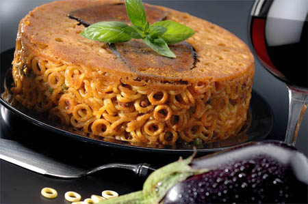
 Ricetta Tipica Sarda

